
Rampant Imperial IPA is a recent addition by New Belgium Brewery in Fort Collins. The beer itself is tasty, but the beer branding is poor, which I think will probably result in poorer-than-expected sales.
Rampant’s Role
Rampant Imperial IPA is part of an ongoing shift on the part of New Belgium’s brewers to accommodate the changing tastes of craft beer fans. New Belgium built its reputation with malt-heavy but balanced beers like 1554 and, of course, Fat Tire. These days, though, the palate of the drinking public has made a significant shift in the direction of hop-flavored beers, especially variations on the IPA. As this style grew in importance, New Belgium found itself in a little bit of a quandary–it didn’t even offer a real IPA, let alone multiple variations on the style! So it debuted one in 2010. Ranger is a little bit different from most of the IPAs offered by other Colorado breweries because of its fairly strong malt profile. And it debuted a lineup of seasonal beers that, on the whole, are significantly hopped, especially Snow Day and Red Hoptober.
However, by this time, they’re still a step behind in trying to capture the hoppy palate of many craft beer fans. Just across town, they have seen the incredible success that Odell’s had with some of their aggressively hopped beers, including the imperial IPA Myrcenary. So it was time to crank the hops up a notch with an imperial IPA of their own. True to form, Rampant remains more balanced than Myrcenary, to be sure, and with a significantly lower alcohol level, though it still tips in at a very significant 8.5% ABV. On the whole, it’s a tasty beer, but not one I’m likely to go out of my way to buy again. Partly because it’s not as radical a taste as I enjoy in my imperial IPAs, but also partly because the branding of the beer kind of put a damper on my enjoyment.
New Belgium’s “Generic” Beer Problem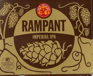
If you look at the labeling and branding of New Belgium’s 6-pack beers, they divide into two traditions. The first is their main line beers, presented with full color labels in the style of Fat Tire and 1554. Their seasonals fit in with this lineup, all of which have attractive stylish images on the label.
The other part of their lineup is the “Explorer” series, whose monochrome labels are intended, I imagine, to convey a certain elegance, but which instead come off as being a little generic. Why? Well, we often say that a picture is worth a thousand words, but in many cases they are like woodwinds, which, though capable of extreme eloquence, are also mute until we give them breath–a word. And when New Belgium selected the words to bring these brands to life, they chose poorly.
The two oldest beers in the Explorer series are Abbey and Trippel, neither of which are names so much as descriptions of styles. And as quickly as that the understated elegance becomes generic sparseness.
I used to think I was the only one who had this impression of the Explorer series beers, but one day I was in the liquor store and overheard a conversation between a relative neophyte to the craft beer scene talking to an employee about New Belgium’s beers. He asked, incredulously, “So these [gesturing at Abbey and Trippel] cost the same as these [gesturing at Fat Tire and 1554]?” The employee responded, “Yeah, and in my opinion they’re not worth it.”
Worse, the generic branding of the Explorer series comes as New Belgium’s size is eating away at its “street cred” as an edgy craft brewer. New Belgium is now the third largest craft brewer in the US, and the 8th largest brewer overall. When my friend moved to Chicago in the 90s, he was happy to find ONE BAR that served Fat Tire. Now every corner bar has the familiar bike logo in neon in the window. Just like Coors or Bud. And the result is that there’s been a backlash against New Belgium. That Chicago friend no longer drinks Fat Tire, and more and more craft beer fans dismiss New Belgium’s beers out of hand.
Some of this is undeserved, but, as I said, they’re not doing themselves any favors by putting generic labels on their beers.
Branding Rampant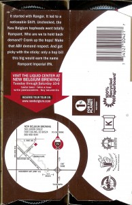
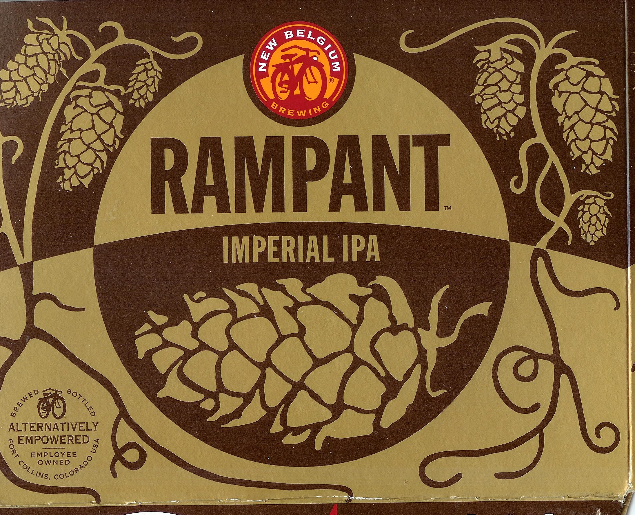
As I noted above, the label and bottle for Rampant Imperial IPA show the same generic styling as the rest of the explorer series. Note that the six-pack carrier has almost no text on it, and certainly no “Home page” text about the brewery, like Isolation. The only thing about the brewery they put on the side is the “Alternatively Empowered” stamp, which I have to admit is a big selling point for me. 100% employee-owned is a good thing, in my mind. On the end of the carrier, there is a small slogan below the Rampant medallion: “Growing Happily Bitter.” Nice. But it’s too low, and why isn’t it on the side, too?
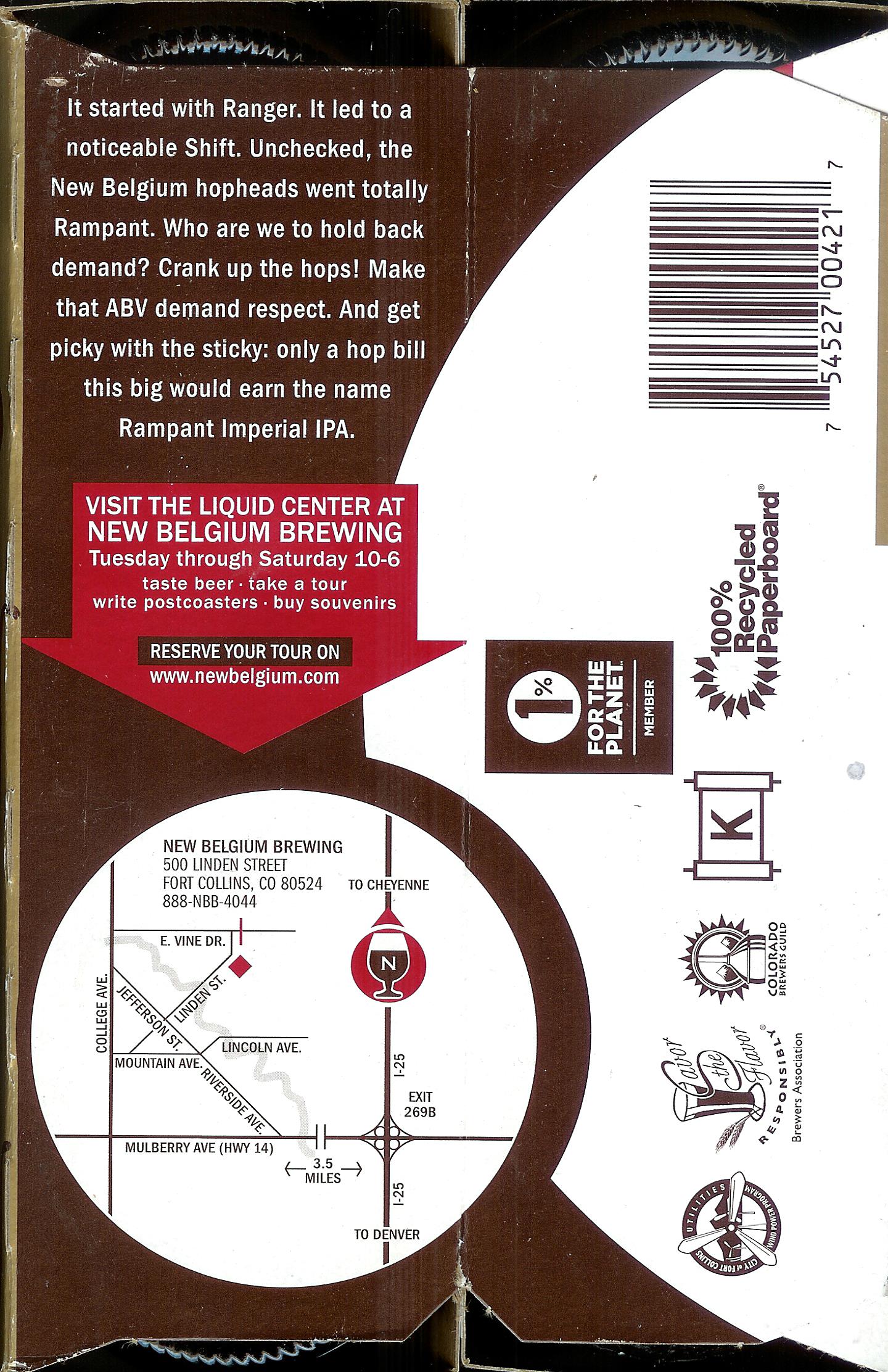
On the underside, the carrier has the basic contact info, and a little bit about the current phase of the explorer series:
It started with Ranger. IT led to a noticeable Shift. Unchecked, the New Belgium hopheads went totally Rampant. Who are we to hold back demand? Crank up the hops! Make that ABV demand respect. And get picky with the sticky: only a hop bill this big would earn the name Rampant Imperial IPA.
Which is actually not bad text for making people kind of excited about the beer. It foregrounds the hops, ties it back to the previous brands, and emphasizes that they’ve been choosy with their selection of hop types.
The only problem is, they put it on the BOTTOM of the carrier. Who lifts up the carrier to read text on the bottom? Text like this has to be put where people can read it if it’s going to make any difference at all.
The text on the bottle deserves some teasing out: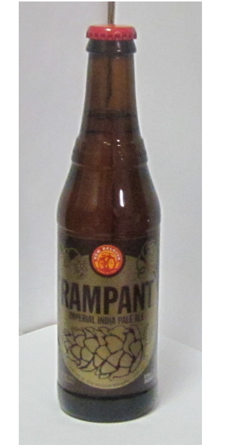
It starts to take over. That craving for hops. The hoppier the happier. The happier the higher the IBU. The higher the IBU the larger the ABV. The higher the ABV the more we’re going to have to keep an eye on this Rampant Imperial IPA proliferating with heavy peach tones, herbal sweetness, and aromatic complexity.
It’s a little weird, but you can see what they’re doing, tying together all the things that hopheads are looking for in their imperial IPAs: hops, IBUs, and ABV, while emphasizing the rounded and balanced nature of the beer.
One of the main problems of this, though, is that the beer doesn’t really deliver on this promise to hopheads. There’re some hops, but it is by no means really a bitter beer. It has the even balance characteristic of New Belgium’s line, which might be good for overall sales, but it won’t satisfy true hopheads. Keeping the IBUs under 100 (Rampant is 85) makes it a very drinkable beer, but it won’t impress hopheads, and some might even think that it doesn’t deserve the label of an “imperial” IPA, which, to me, is another big branding sin: targeting the wrong market.
Perhaps New Belgium is aware the brand is weak, because they are bolstering it with an extensive campaign of videos featuring the character “Bitterman.” I want to talk about those, but not here. I’ll address them soon in an article entitled, “Can Content Marketing Bolster a Weak Brand?”
If you have a brand you want to refine or improve, please contact WriterMC today to talk about the role words play in creating and promoting your brand.